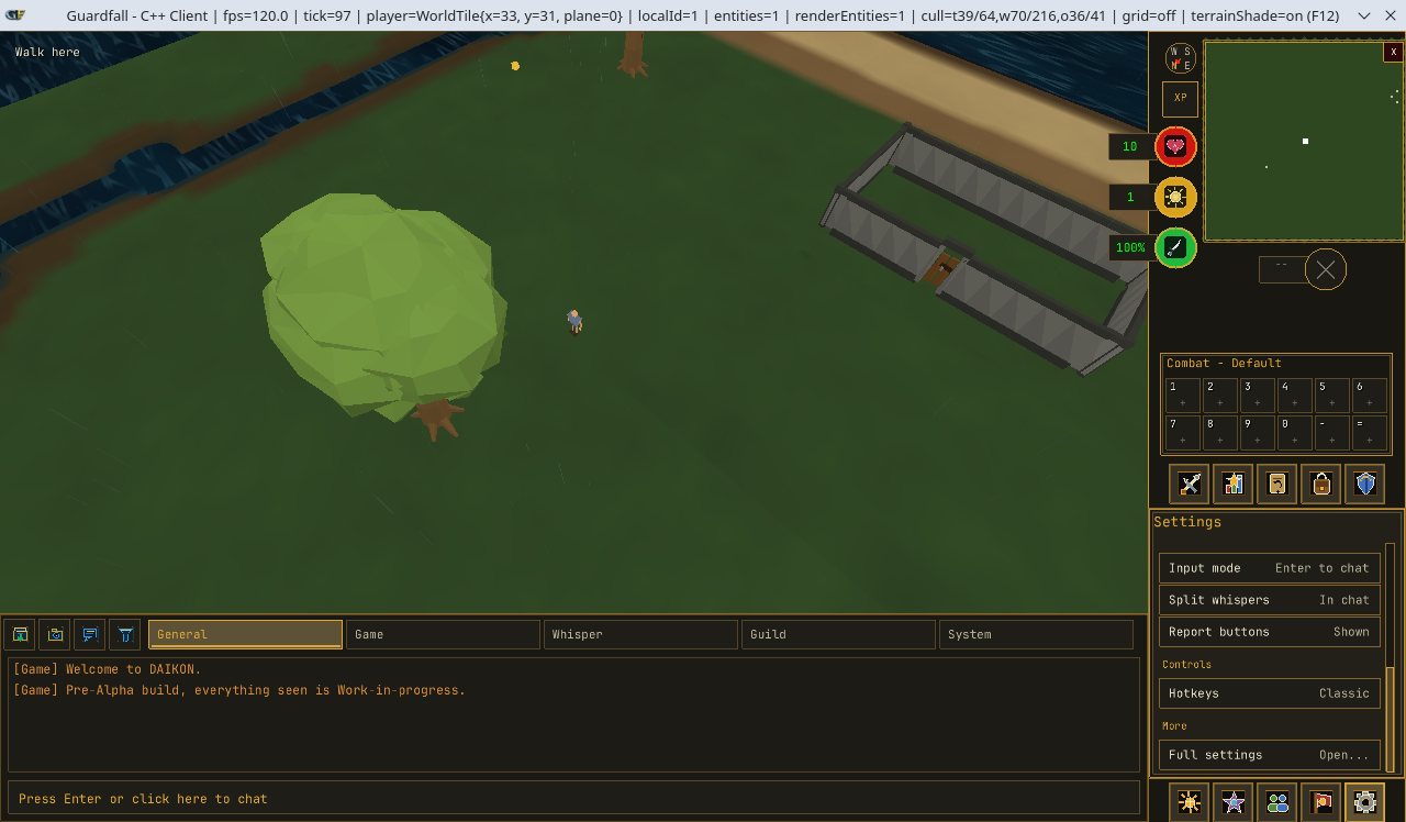
Guardfall has reached an important stage in development.
The game already had the beginnings of a playable loop. Players could enter the world, move around, gather resources, manage items and fight NPCs. However, many of those systems still existed as separate pieces inside what was visibly an early development client.
Over the latest development period, the focus has shifted from proving that individual systems work to making them feel like parts of the same game.
Guardfall now has a structured fixed and resizable interface, larger gameplay windows, server-controlled interface opening, paired inventories, its first minimap, NPC dialogue, improved chat, clearer fonts and the foundations of a proper combat shell.
This is a substantial update, so we will begin where the work began: the game client itself.
Building a Proper Gameplay Shell
The first step was establishing the structure around the game world.
Guardfall already had a chatbox, a collection of gameplay tabs and several status displays, but they had been introduced at different stages of development. They worked, but they did not yet form a complete and predictable gameplay layout.
The client now supports two distinct ways to play:
- Fixed mode, built around a compact and deliberately arranged game window.
- Resizable mode, which allows the world view to expand while retaining the same core interface.
Both modes use the same underlying interface systems. They are not separate clients or unrelated layouts.
Fixed Mode
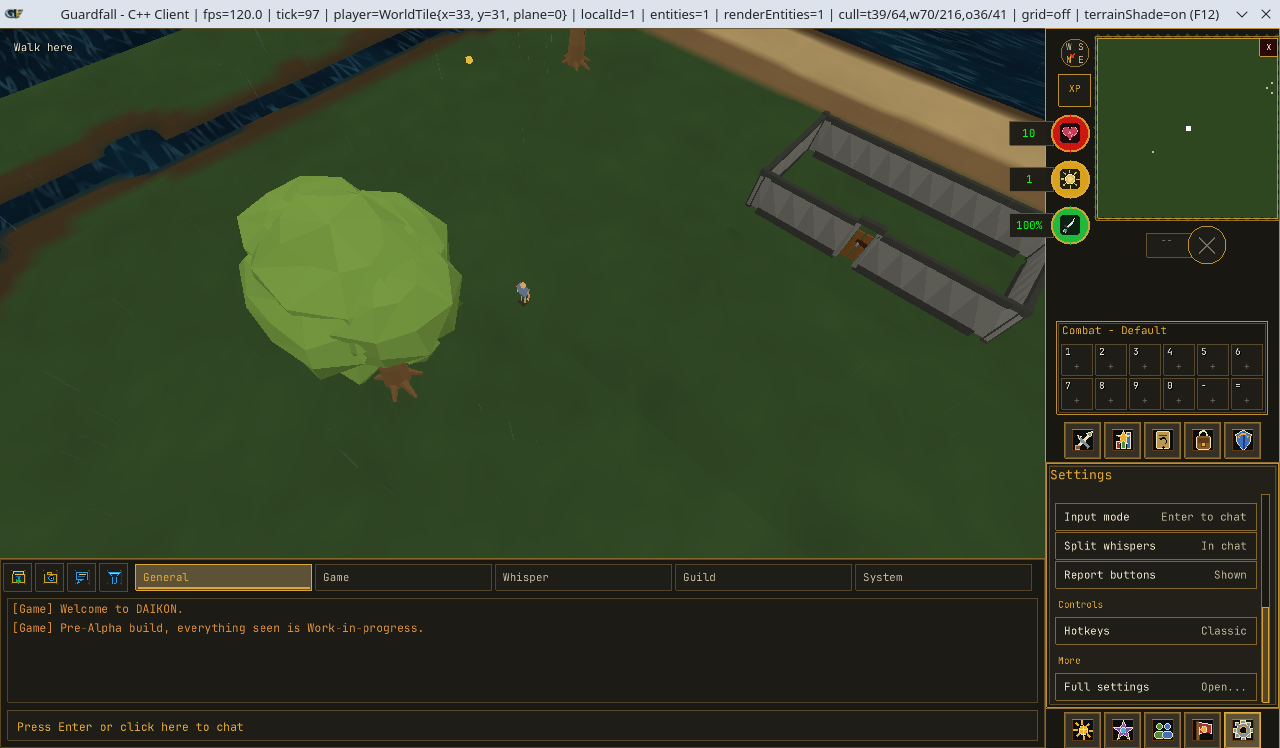
Fixed mode is intended for players who prefer a traditional game-client layout.
The game viewport, chatbox, minimap, tabs and player-status controls remain in known positions. This gives the interface a consistent shape and allows each component to be designed around an exact amount of available space.
The right-hand tab shell uses a two-row arrangement, with five tabs above and five below. The minimap and status controls occupy the space above those tabs, while the combat bar is placed beneath the minimap as part of the same gameplay cluster.
Switching into fixed mode also locks the interface arrangement. Players cannot accidentally detach or drag a panel away from the layout it was designed for.
Resizable Mode
Resizable mode allows the game viewport to grow with the client window.
The familiar tab shell remains available, but selected non-combat interfaces can also be detached and positioned elsewhere on the screen. This allows players to keep useful information visible without forcing every interface into the same narrow side panel.
Moveable interfaces include areas such as:
- Skills
- Inventory
- Equipment
- Faith
- Magic
- Guild
- Settings
Core gameplay elements remain locked together. The chatbox, minimap, status displays, tab shell and combat controls should always remain dependable.
Guardfall therefore separates ordinary gameplay from layout-editing mode.
During normal play, moveable panels do not display large drag bars or desktop-style window controls. When layout editing is enabled, temporary controls appear so that panels can be repositioned, closed or restored.
Panels also snap to a grid, making it easier to align them cleanly with the rest of the interface.
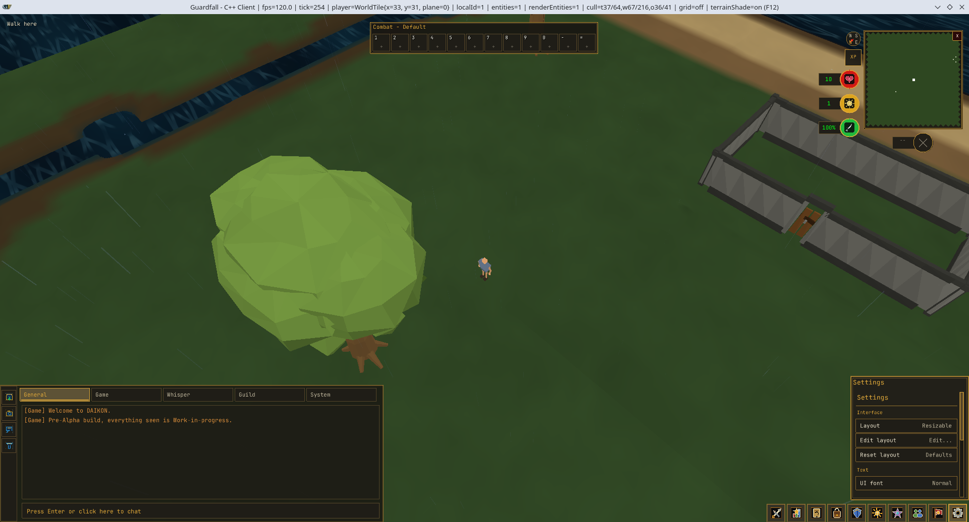
The intention is to offer flexibility without turning Guardfall into a collection of overlapping windows.
New Display Interfaces
Once the overall gameplay shell was established, the next step was introducing a proper system for larger interfaces.
Until this point, most gameplay interfaces were either side tabs or temporary panels drawn directly by the client. That worked for compact systems such as the inventory, but it did not provide enough room for activities such as banking, shopping or detailed character management.
Guardfall now supports Display UIs.
A Display UI is a larger gameplay interface that opens over the world view while keeping the game visible behind it. It provides more space than an ordinary tab without replacing the complete gameplay screen.
These interfaces will support systems such as:
- Banks and deposit boxes
- Shops
- Character management
- Larger settings pages
- Activity interfaces
- Progression and collection screens
- Other interactions that cannot fit inside the tab area
This is more than a new visual window.
Display UIs use the same underlying component system as the rest of the client, including text, sprites, item containers, hover actions, input handling and player-selected font scaling.
A new activity no longer needs its own unrelated method of drawing and controlling an interface.
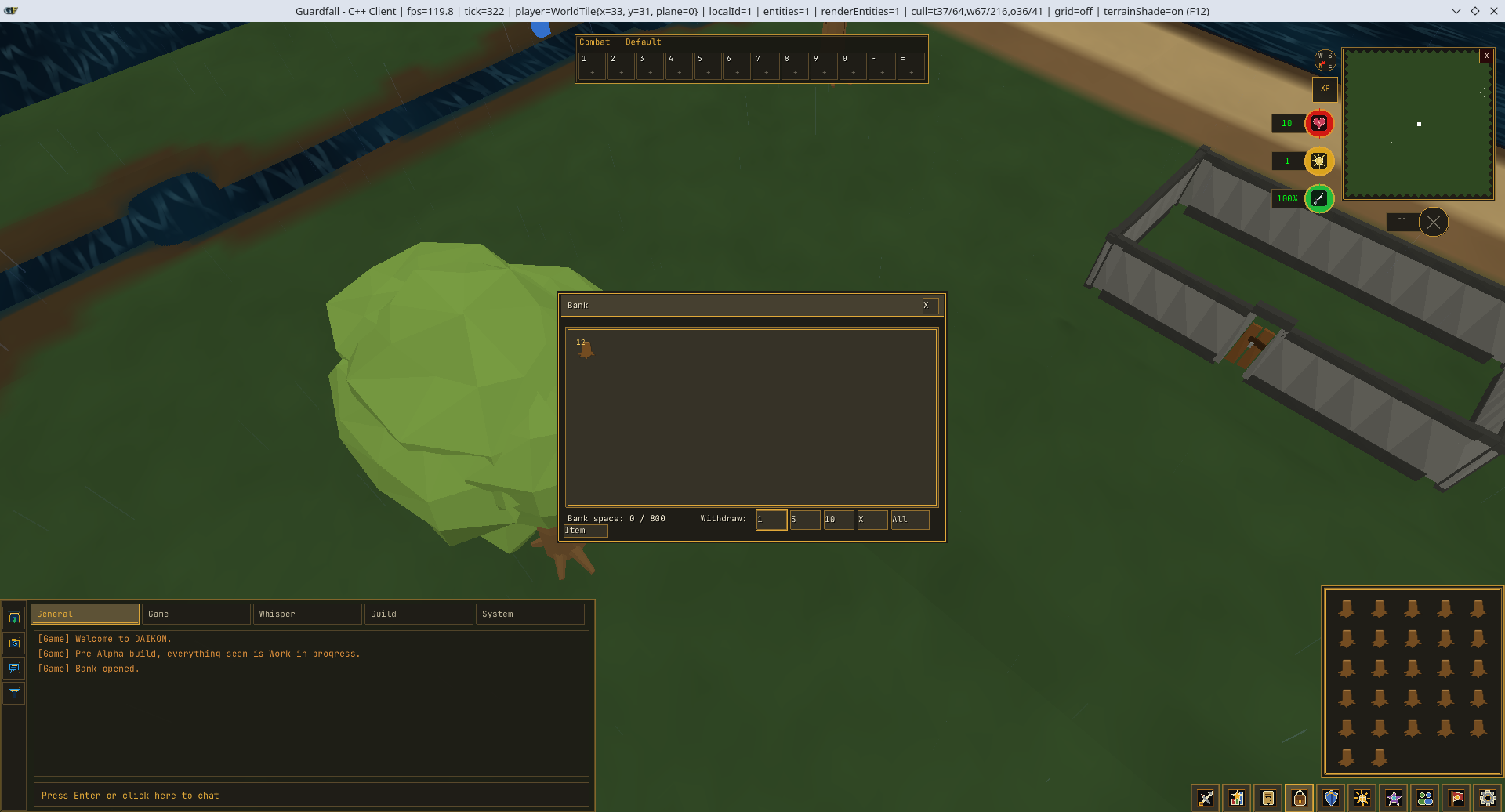
Interfaces Can Now Be Opened by the World
After Display UIs could be shown by the client, they needed to become part of actual gameplay.
Guardfall now has a server-controlled interface-opening system.
When a player interacts with an NPC, object or activity, the world server can tell the client which interface should open. It can also close or replace that interface when the interaction ends.
This allows the server to remain responsible for the context in which an interface is being used.
For example, the world can verify that:
- The player is still close enough to the object or NPC.
- The interaction is still valid.
- The player is allowed to use the interface.
- The correct item container remains available.
- The interface has not been replaced by another activity.
This is particularly important for banking, shopping, trading and other systems where the client should not be able to decide for itself what the player can access.
From a player’s perspective, the result is straightforward: interacting with something in the world can now open the correct gameplay interface as part of the activity.
Behind that interaction, the client and server understand why the interface is open and which gameplay state it belongs to.
Interface Pairing
Some activities require more than one interface at the same time.
A bank needs to show the player’s stored items, but the player also needs access to the inventory from which those items will be deposited. Shops, trades and other item-based activities will require similar arrangements.
Guardfall’s interface-opening system now supports paired interfaces.
A main Display UI can be opened alongside a supporting interface, with each one connected to the correct item container and set of actions.
When a bank is opened:
- The primary panel displays the bank.
- A supporting panel displays the player’s inventory.
- The bank provides withdrawal actions.
- The paired inventory provides deposit actions.
- Both interfaces remain part of the same banking interaction.
- Closing the activity closes the pair together.
The paired inventory is not simply another copy of the ordinary inventory tab. It is the player’s inventory being shown in a banking context, with the actions appropriate to that activity.
Building this exposed several problems with deposit quantities. Some deposit options worked from the main bank but did not work correctly from the supporting inventory panel.
Those actions have now been routed through the correct interface and container context.
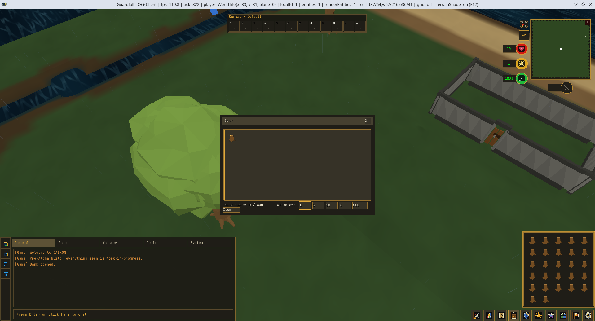
This system will later support other interactions that need two related panels without creating completely separate versions of the same inventory.
Item Dragging and Organisation
The new interface and container systems also created the foundation for proper item dragging.
Players can now drag items between supported slots to reorganise editable containers.
During a drag operation:
- The original item slot is shown in a ghosted state.
- A semi-transparent version of the item follows the cursor.
- The destination can be checked before the move is submitted.
- The world server validates the final rearrangement.
The rules depend on the container being used.
Players should be able to organise their own inventory and bank. They should not be able to reorder the stock inside a shop simply by dragging items across it.
Container behaviour is therefore controlled by the active interface and gameplay context rather than being applied to every item grid automatically.
The server also remains authoritative. A modified client cannot use an item-drag request to rearrange a container that does not permit it.
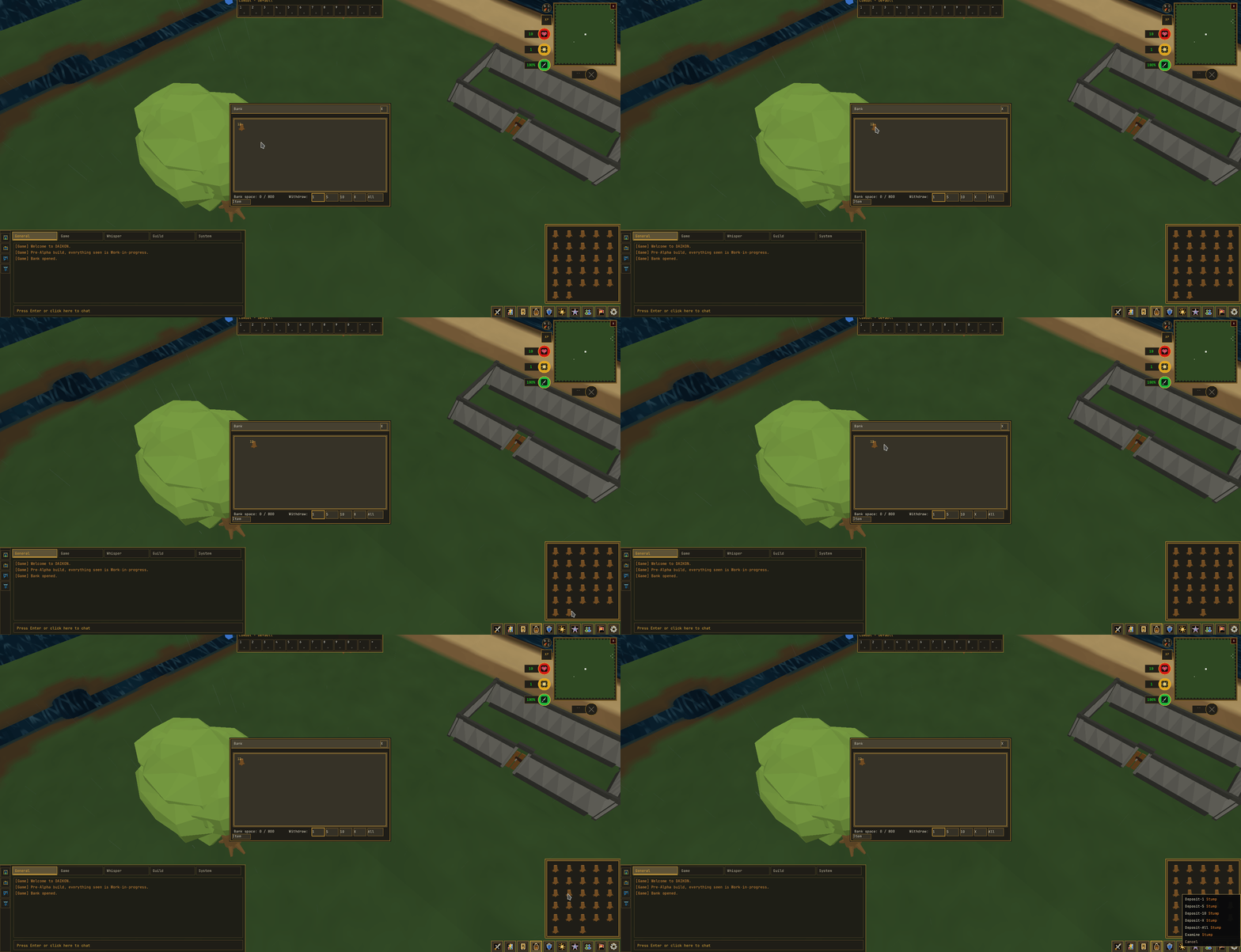
This system is continuing to receive testing across the ordinary inventory, bank storage and paired interfaces.
Guardfall’s First Minimap
With the wider interface structure in place, work moved to one of the most visible additions in this update: Guardfall’s first proper minimap.
The minimap displays an overhead view of the world surrounding the player. Nearby terrain, paths and markers can be recognised without opening a separate map screen.
It also rotates with the game camera.
As the player changes the direction of the camera, the minimap rotates to match. A compass remains attached to the side of the map, providing a fixed directional reference while the world moves beneath it.
Players can also use the minimap for movement.
Clicking a valid point on the minimap converts that position into a destination in the game world. The destination is then handled through the same movement and pathfinding system used when clicking directly on the terrain.
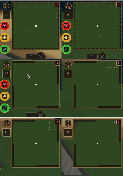
Getting this working correctly required the client to translate between several different coordinate systems:
- The player’s world position
- Nearby map tiles
- Camera rotation
- Minimap rotation
- The size and position of the minimap interface
The first implementation exposed an orientation problem that caused parts of the map to appear flipped. The minimap and camera were not applying rotation in the same direction.
That conversion has since been corrected, allowing landmarks and destinations to appear on the expected side of the player.
The terrain representation has also been refined so that the minimap reflects the structure and shading of the surrounding map rather than displaying every tile as an identical square.
Player Status around the Minimap
The area surrounding the minimap has become the centre of Guardfall’s player-status display.
Important resources are now grouped around the map instead of being spread across temporary development panels.
The current status cluster includes support for:
- Hitpoints
- Faith
- Run energy
- Adrenaline
These values are intended to be readable at a glance.
Hitpoints can move from green towards red as the player becomes more seriously injured. Run energy and adrenaline can be presented as percentages, while Faith displays the player’s current resource against its maximum.
Resizable mode can provide more room for these values, while fixed mode uses compact orbs and displays that fit around the authored minimap layout.
The same underlying player information is used by both modes.
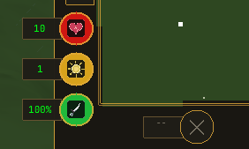
The orbs have gone through several visual and behavioural revisions during this work.
The resizable versions now follow the same draining behaviour as the fixed layout, and the colours have been made consistent across both presentations:
- Hitpoints use red.
- Faith uses gold.
- Run energy uses green.
The adrenaline and special-attack area is also being integrated into this cluster rather than existing as a separate temporary control.
A Proper Logout and Disconnect Flow
A logout control has been added beside the minimap.
Rather than immediately closing the client, selecting it opens a dedicated logout interface. This provides a proper location for logging out, returning to the lobby and eventually switching worlds.
This work also exposed a wider problem with connection recovery.
World-entry tickets are deliberately short-lived. They allow an authenticated character to enter a particular world, but they are not intended to be reused indefinitely.
Previously, an unexpected world disconnection could return the player to a lobby that appeared usable while still holding a ticket that was no longer valid. Selecting a world from that state could fail because the original ticket had already been spent.
The client now treats several situations separately:
- The player intentionally logs out.
- The world connection is unexpectedly interrupted.
- The account session has expired.
- The player returns to the lobby and chooses another world.
Before attempting another world connection, the client must have a valid authenticated session and obtain a new world-entry ticket.
This prevents players from being sent back to a lobby that looks functional but cannot actually reconnect.
Escape also no longer closes the entire client unexpectedly. Logout and connection actions now have their own deliberate flow.
NPC Dialogue Comes to the Chatbox
The next major gameplay addition was Guardfall’s first complete NPC dialogue presentation.
Conversations appear inside the chatbox area rather than opening a generic window in the centre of the game.
This keeps dialogue connected to the existing gameplay interface and preserves the player’s view of the world while a conversation is taking place.
The initial dialogue system supports:
- A centred speaker name
- Multiple lines of dialogue
- Click-to-continue
- Space-bar continuation
- Multiple player responses
- Branching conversations
- Server-controlled progression

Dialogue trees can be written through Guardfall’s server-side scripting support.
This allows conversations to react to gameplay conditions without requiring every line and branch to be permanently compiled into the world server.
As development continues, dialogue will be able to respond to factors such as:
- Quest progress
- Items carried by the player
- Skill requirements
- Previous conversations
- Player choices
- Completed objectives
- Other world conditions
The first version deliberately avoids animated portraits or character chatheads.
The priority was to establish a reliable conversation system first. More elaborate presentation can be added once dialogue, branching and quest-state integration are operating correctly.
Clearer Text across the Client
As more interfaces became visible, the old UI font sizes became one of the client’s most obvious problems.
Guardfall uses a pixel-style interface font. At the previous scales, parts of some letters were rendered so small that individual pixels disappeared.
This caused text to look thin, broken or inconsistent even when the underlying font was correct.
The three interface font settings have therefore been increased:
- Small: approximately
1.12× - Normal: approximately
1.20× - Large: approximately
1.32×
The change is not limited to increasing a few individual labels.
Guardfall now uses a shared UI font system across supported interfaces. Panels no longer create unrelated font sizes independently.
Interfaces can request consistent roles such as:
- Body text
- Titles
- Prominent display text
- Small supporting text
Dense interfaces can also request the next available font tier when necessary.
The Skills tab, for example, displays more text and values than an ordinary button. Under the revised system, it can use a larger tier while still respecting the player’s overall preference.
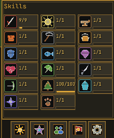
Chat retains its own font preference because chat readability and interface density are different concerns.
The same shared interface scaling is now being applied across inventory panels, equipment, skills, settings, Display UIs and other authored interfaces.
Rebuilding the Gameplay Tabs
The font work was part of a wider effort to move Guardfall’s tabs onto the shared interface system.
Several earlier tabs were drawn directly by the gameplay overlay. This was useful while proving that the systems worked, but it meant each panel had to manage its own:
- Fonts
- Spacing
- Item slots
- Clipping
- Hover behaviour
- Input
- Scaling
- Fixed and resizable positioning
The Inventory, Equipment, Skills, Faith, Magic, Guild and Settings areas are being standardised through the same interface framework used by the newer Display UIs.
This allows the client and UI Editor to share the same component model.
An interface created in the editor can use the same concepts that the game understands, including text, sprites, models, containers, actions and server-provided values.
The UI system now distinguishes between:
- Tab interfaces, displayed inside the side shell.
- Display interfaces, opened over the gameplay view.
- Full-screen interfaces, used when an activity needs to cover the complete client.
This makes future interface development more consistent and reduces the need for temporary client-specific panels.
The Skills and Settings tabs both required additional attention during this transition.
The Skills interface needed larger and more consistent text, while the Settings interface exposed scrolling, spacing and scaling problems once more options were added.
Those issues have been addressed through several refinement passes rather than redesigning the entire gameplay shell again.
Chat and Overhead Messages
The interface work also included a substantial communication pass.
Public messages can now appear above the player who sent them, allowing nearby conversation to be followed directly in the game world.
Overhead messages remain on a single line and use a slightly larger font tier so that they stay readable against terrain, objects and other characters.
The main chatbox now handles longer messages more reliably.
Previously, messages could disappear beyond the right-hand edge of the panel, particularly when using a larger chat font.
Messages now wrap across multiple visible lines.
This applies to:
- Public chat
- Private messages
- Split private chat
- Longer system messages
- Text rendered at larger font sizes
- Long words without convenient spaces
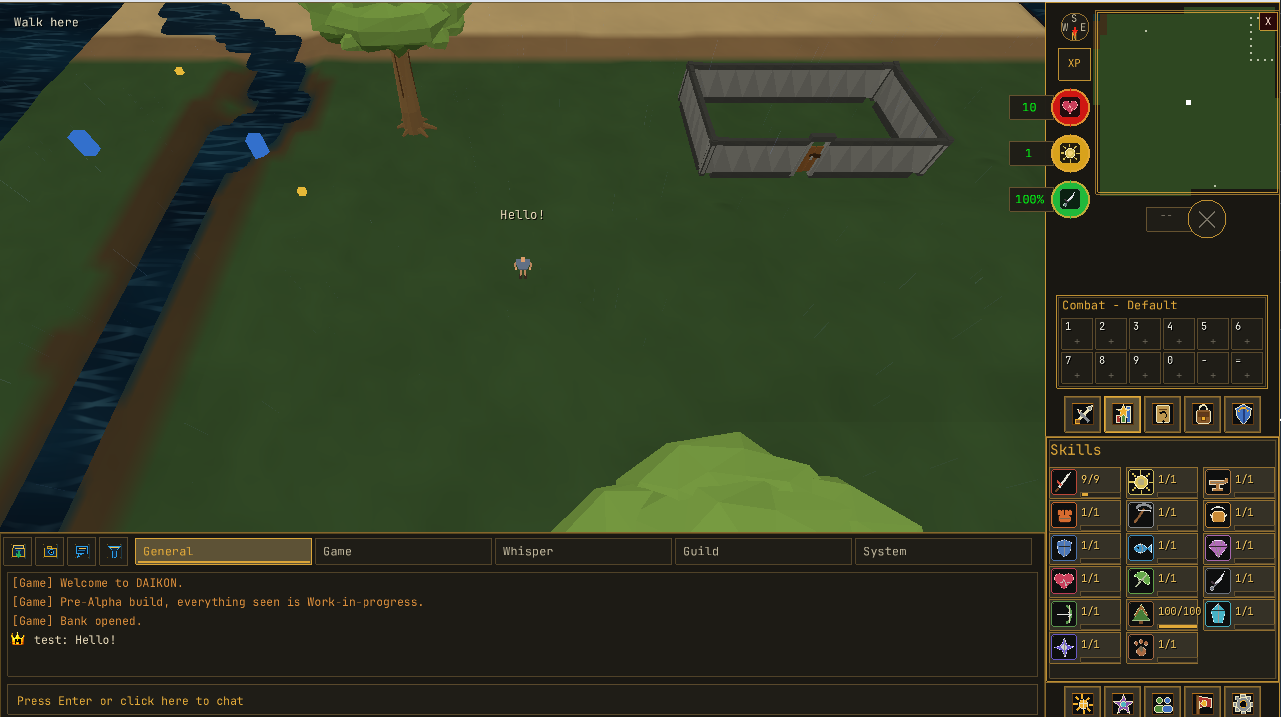
The input field remains on a single line. When the player types beyond the visible width, the field scrolls horizontally rather than expanding over the chat history.
Player-written messages are currently limited to 80 UTF-8 characters.
Text editing has also been corrected so that backspace cannot remove only part of a multi-byte character and leave damaged text behind.
These changes ensure that the same message can be typed, transmitted and displayed without being truncated or corrupted at a different stage of the process.
Camera and Input Improvements
Several input changes were introduced while the interface was being rebuilt.
The camera can now be rotated by holding the middle mouse button and dragging.
This provides a more natural mouse-based camera control for players familiar with click-to-move games.
Arrow-key camera controls also remain active while the chat input is open. Typing a message should not prevent the player from adjusting the game view.
Older development controls are being removed where they conflict with the long-term control scheme.
Guardfall is primarily designed around click-to-move navigation, so temporary WASD movement controls are not intended to remain as default gameplay bindings. Removing those conflicts leaves more keyboard space for interfaces, combat actions and configurable shortcuts.
Hover behaviour has also been corrected.
Moving the cursor over an interface now produces the interface’s own action instead of continuing to display Walk here from the world behind it.
Tab shortcuts are also moving towards a configurable system.
The Settings interface can open a key-binding modal that waits for the next valid key press and assigns it to the selected tab. Gameplay input is suspended while the modal is listening, preventing one key from simultaneously being typed into chat and assigned as a shortcut.
XP Drops and Progress Feedback
The status cluster around the minimap has also become the home of Guardfall’s XP feedback.
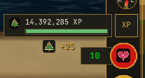
XP drops are designed to remain compact.
Instead of surrounding every reward with a large box, a drop displays:
- The relevant skill icon
- The amount of XP awarded
For example, a Woodcraft reward can appear as the Woodcraft icon followed by the XP value.
Players can adjust the skill-icon and text size together, keeping both parts of the drop in proportion.
This feature required several rounds of iteration.
An early version caused XP values to appear beside the XP-drop toggle without moving in the intended direction. The current design instead has rewards flow upward towards a persistent XP bar.
The XP bar is attached beside the XP-drop control and displays the player’s current progress rather than appearing only briefly when XP is awarded.
The first implementation did not remain visible consistently, so its position and lifetime were revised.
This remains an area of active refinement as the different skill, icon and font-size combinations are tested.
Building the Combat Shell
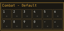
The new gameplay layout also establishes the location and behaviour of Guardfall’s combat bar.
The combat bar is intended to provide quick access to frequently used actions without requiring players to repeatedly switch between tabs.
It can support:
- Food
- Potions
- Equipment
- Faith abilities
- Spells
- Special attacks
In fixed mode, the bar sits beneath the minimap and above the tab shell.
Slots can be assigned hotkeys, and an item or ability can provide a default action when activated from the bar.
The combat bar does not create a second set of rules for inventory items.
When an item is activated through the bar, the server resolves the matching item from the player’s actual inventory and processes its normal action. The bar is a quicker route to an existing action, not a way to bypass inventory or server validation.
Empty or unavailable actions can be greyed out, and the bar continues to operate within Guardfall’s normal tick-based gameplay.

Longer term, players will be able to save action-bar layouts as presets.
Those presets can later be associated with planned bank presets, allowing an equipment and inventory setup to restore the appropriate combat bar at the same time.
The special-attack and adrenaline controls are being incorporated into the same combat cluster rather than added as unrelated buttons elsewhere on the screen.
One Interface System, One Editing Workflow
The live-client work has also changed the role of the UI Editor.
The editor is no longer being treated as a separate mock-up tool. Its purpose is to author the actual interfaces consumed by the game.
It supports the interface categories used by the client, including tabs, Display UIs and full-screen interfaces.
The workflow is being expanded with features such as:
- Snapping
- Undo and redo
- Ghost previews
- Layer locking
- Viewport presets
- Diagnostics
- Cache loading
- Interface creation and editing
- Shared font roles
- Container and sprite placement
The goal is for future banks, shops, quest interfaces and activity screens to be created through a repeatable authoring workflow instead of being individually assembled in client code.
This matters because Guardfall will eventually need a large number of interfaces.
Improving the editor now reduces the amount of one-off work required later.
Part One: What Changed during the Process
A large interface update rarely arrives in one clean pass.
Combining systems that were previously developed separately exposed problems that could not be seen while each one existed in isolation.
Recent client fixes and refinements include:
- Correcting the flipped minimap orientation
- Matching minimap rotation to the camera
- Keeping the compass aligned with the minimap
- Allowing arrow-key camera movement while typing
- Adding middle-mouse camera dragging
- Preventing Walk here from appearing over interfaces
- Correcting deposit actions from paired inventory panels
- Restricting item sorting to valid containers
- Preventing used world-entry tickets from being reused
- Separating logout from unexpected disconnection
- Increasing UI font sizes
- Preventing small pixel-font glyphs from losing detail
- Correcting Skills-interface text scaling
- Repairing Settings-interface scrolling and spacing
- Applying interface scaling through one shared font system
- Wrapping long public and private messages
- Correcting split private-chat wrapping
- Making backspace safe for UTF-8 messages
- Improving overhead-chat readability
- Correcting status-orb colours and draining behaviour
- Revising the position and behaviour of XP drops
- Making the XP bar persistent
- Removing large boxes from individual XP drops
- Keeping XP icons and text scalable together
- Standardising gameplay tabs through the shared interface system
- Preventing normal play from accidentally dragging interface panels
- Keeping fixed mode locked to its authored arrangement
Not every one of these changes is a headline feature.
Together, they determine whether Guardfall feels like a connected game or a collection of internal test screens.
Guardfall’s Client Is Taking Shape
This first part of the update represents one central change: Guardfall is beginning to feel like a complete game client.
Players can now navigate through a minimap, speak to NPCs, open contextual interfaces, organise their items, read clearer information and receive more immediate feedback from the world.
The interface is also being built around systems that can continue expanding. Banks, shops, quests, activities and combat controls no longer need to exist as unrelated panels created one at a time.
There is still more refinement ahead. Item dragging, XP feedback, combat controls and the different gameplay layouts will continue to improve as they are tested together.
As a little teaser, please watch the a short video! Guardfall - Client themes, and Client Customization.
In Part Two, we will look beyond the client itself: Guardfall.com’s visual overhaul, the shared appearance presets, why the development roadmap has changed, and how those changes lead towards quests, combat and the Free-to-Play world.